Why Do You Need Instagram Landing Page and How to Create One

Instagram can be a powerful tool to start your business, especially if you don’t have a website yet.
But while it is an amazing platform to grow your audience, it has one major drawback – you can’t add links to your post!
With the exception of shoppable posts for ecommerce products, you get one link for your entire profile. And that is your link in bio.
Many business owners choose to just link to their website, or to the current products they want to promote.
But what if you don’t have a website? Or what if you want to feature more than one link?
That’s where Instagram landing pages come in 👇
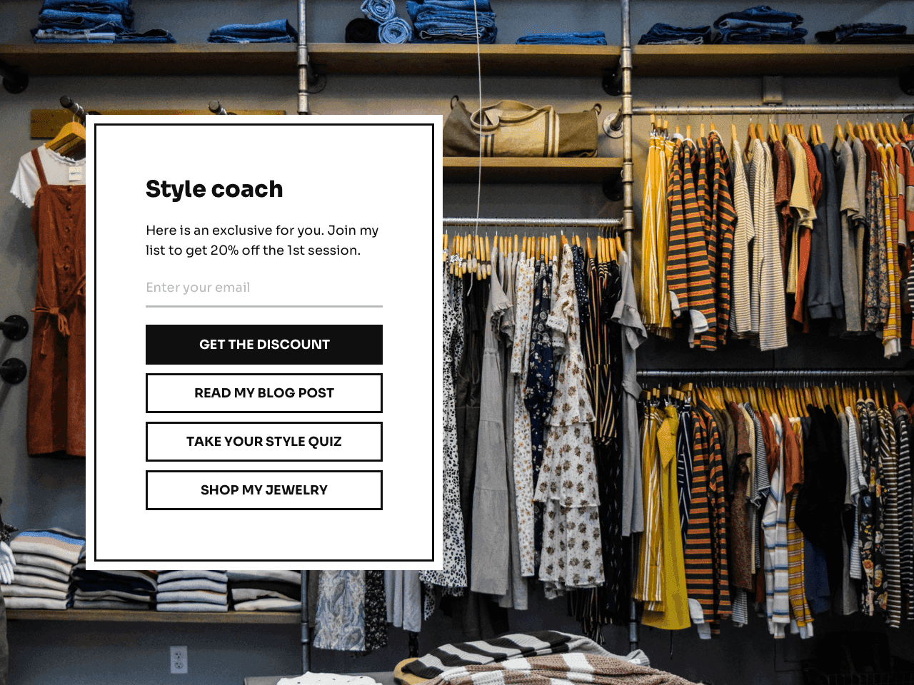
Instagram landing pages help you feature as many external links as you want. But beyond that, you’ll be able to capture emails, collect orders or feedback, and more.
In this post, we’ll review the best practices for creating Instagram landing pages. We’ll also show you how to create one for your business and link to it from your Instagram bio – all in less than 5 minutes, using a zero-code app named Getform.
Try Getform today
Create an Instagram landing page that reflects your brand identity. Dozens of templates, zero coding.
Why you should use an Instagram landing page for your bio
Instagram landing pages allow you to create a single page that contains several URLs and data capture fields.
This is how it works. Once you design your landing page (we’ll show you how to do it at the end of this article), you can get a direct link to it and paste it to your Instagram bio. When your profile visitors click the link, the landing page will pop up in a new window.
It’s that simple!
These types of landing pages provide a more customized experience for your visitors. Not everyone is looking for the same thing when they visit your profile – some may want to read more about your brand and find out more about your authority before they trust you. While others may want to see your products or services right away.
Here is another example of what a landing page may look like:
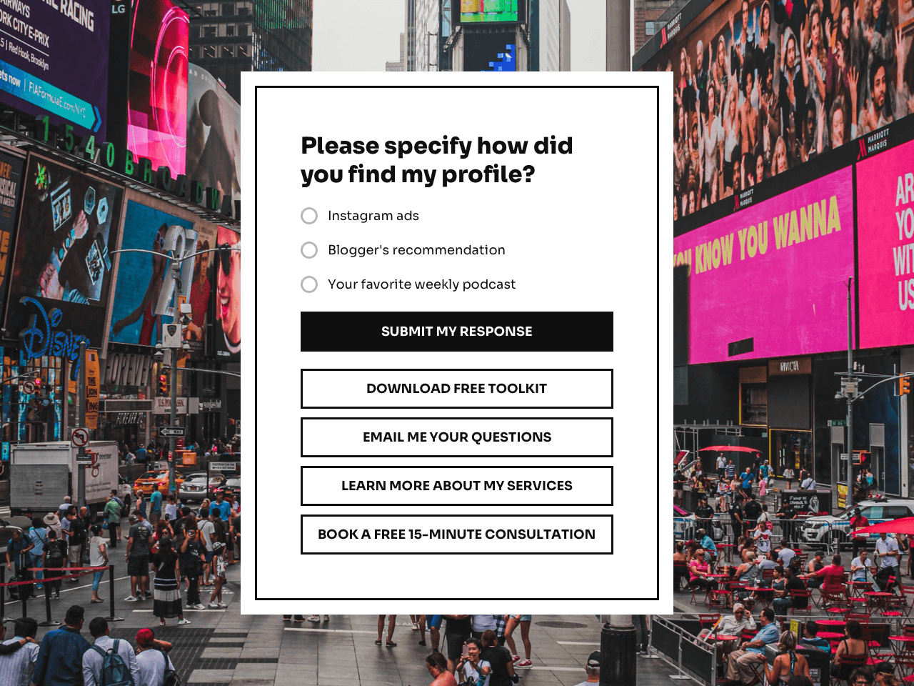
See? You don’t have to constantly replace your link in bio when you want to feature something new. You can just add fields and buttons without getting rid of the important links.
Should I always use an Instagram landing page?
The short answer – not necessarily.
A landing page that contains several links will give your visitors more options, yes. But if your goal is to drive traffic to a very specific page during a certain period of time, you should streamline your profile to that specific link.
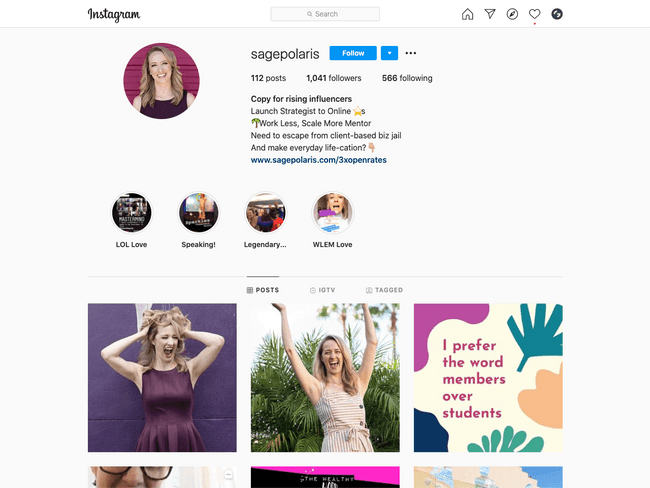
For instance, Sage Polaris, a launch strategist, is currently targeting all her efforts to grow her email list.
The reason why? She’s currently fully booked with clients for the rest of the year!
So why give her audience the option to check out her website and offers when she doesn’t really need it right now?
Instead, she offers a single link, which redirects her audience to a lead magnet:
So, if you’re launching something new, running a flash sale, or maximizing your efforts on growing your email list, forget about the landing page for now and simplify the options for your audience.
You can always bring it back later!
Best practices to create your own Instagram landing page
The sky is the limit when it comes to Instagram landing pages. But there are a few tips and tricks you can use to increase your click-through rates and get more of your Instagram visitors to turn into subscribers or buyers.
For instance, most tools won’t give you a limit on the number of links you can add to your landing page.
Does that mean you should add EVERY possible link you can think of?
Not really. The more links you add to your landing page, the more overwhelmed your visitors will be.
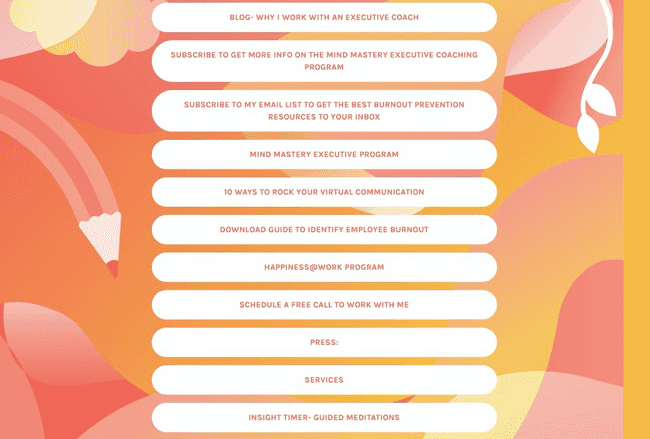
Take a look at this landing page as an example:
There are so many options to choose from that it can be distracting.
But then, how do you choose which links you want to include?
It all depends on your current business goals. Before you create your Instagram landing page, ask yourself what matters the most to you right now. Is it:
- To make more sales, no matter on what product/service?
- To increase conversion rates on a specific offer?
- To grow your email list?
- To increase trust via authoritative content?
- To collect feedback?
- To launch a new offer?
Your goals should define which links make it on your landing page.
If you’re looking for a specific outcome, you don’t necessarily need to include your website’s home page. However, if you want to increase recognition, linking to your website might not be such a bad idea after all.
Let’s walk through a few examples.
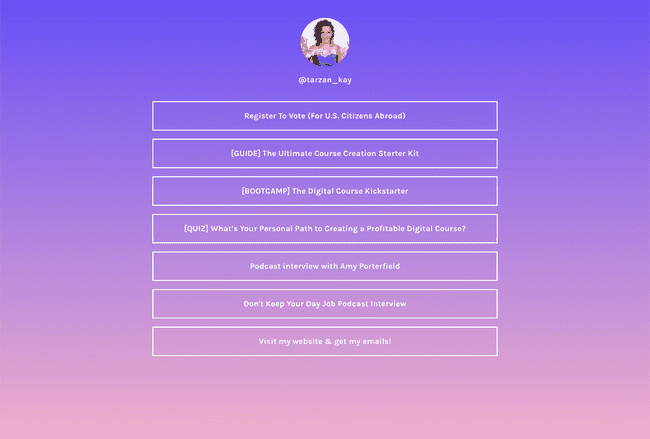
Tarzan Kay, who is an email marketing strategist, has five links on her current Instagram landing page.
Let’s break down why each link is there in the first place.
The first link redirects to her lead generation quiz, which has been a powerful tool to grow her email list in the past. This quiz is typically the entry point to her business, so it makes sense to leave it there.
However, at the time of writing this post, Tarzan is also in the middle of a launch. She’s an affiliate for Amy Porterfield, who is an expert in digital courses.
The second link is a lead magnet for a free 30-day bootcamp that feeds in directly into this promotion. The third link establishes her authority with a podcast interview with Amy herself.
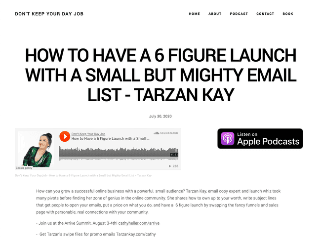
The fourth link, which is another podcast, links to this episode:
At first, it might seem confusing that she left this there.
However, this was a smart move on her part. Tarzan is proving to her audience that she knows her stuff when it comes to launches by showing she’s been on not one, but TWO podcast episodes. In truth, she’s been on many more, but this one does the job.
Why does that matter? Well, Amy Porterfield’s audience wants to create and launch courses. So it would make sense that they would be attracted to someone like Tarzan, who has proven time and time again that she knows this topic like the back of her hand.
The last link closes the loop by giving visitors the option to learn more about Tarzan by visiting her site and opting into her email list. This is great for those who don’t necessarily want to launch a course yet, but who are still interested in Tarzan’s expertise.
This landing page only contains five links, and as you can see, every single one serves a specific purpose. Chances are, the next time you visit Tarzan’s Instagram, links will be different.
What about someone who isn’t running a particular promotion or launch?
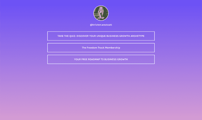
Meet Kristen Westcott, a business growth strategist. Her Instagram landing page is much simpler than Tarzan’s, with only three links.
Having fewer links means Kristen can get more clicks to these specific pages, instead of splitting it up between five or more. And for her current business, this makes sense.
Kristen just launched her brand new lead generation quiz, which will help her grow her email list in a way that nurtures and segments her new audience.
Right now, Kristen is fully booked with retainer clients. So it makes sense that she would instead try to grow her email list and forego a general link to her website.
If you take a look at the third link, it redirects to another lead magnet that is separate from the quiz. So, even if visitors aren’t interested in the quiz, they still have another way to join her email list.
But what about the second link?
This redirects to Kristen’s new income stream, which is a paid membership.
You might be wondering, why is there only one link for a paid offer, and two for her email list? This is most likely because buyers of her membership need to be nurtured before deciding to invest. That’s what her email list is for.
In the future, Kristen may decide to run a limited-time promotion for her membership. In that case, it would make sense to add and prioritize links that directly relate to that offer, just like Tarzan did on her own landing page.
Other people’s goals might not be aligned with yours. However, you can follow the example of established experts in your field as a source of inspiration.
Remember that less is more, and if you think a certain link doesn’t serve a solid purpose at the moment, don’t add it to your page.
Create your own Instagram landing page
There are several ways you can create your own Instagram landing page. The best part about it, you don’t need to create a new page on your website. In fact, you don’t even need a website.
For instance, a tool called Getform allows you to build a custom page that opens in a new window when a visitor clicks the link in your bio. This page can contain your links, your call to action, email capture form, and even a survey.
All that – without the hassle of designing a web page from scratch.
If you are just getting started in your business and don’t have your own website, you can use your Instagram landing page to redirect people to:
- Blog posts you host on a third-party platform
- Podcast episodes with your participation
- Product pages on 3rd platforms such as Amazon or Etsy
- Webinar, giveaway, or newsletter sign-up pages
Because you can tweak your page to look exactly how you like it, you can stand out on Instagram and make sure your visitors take the action you want them to take.
How to create an Instagram landing page step-by-step
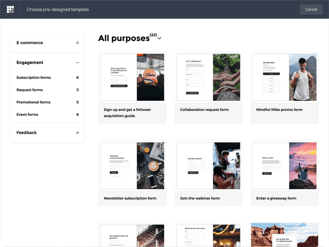
The fastest way to create an Instagram landing page is to use a ready-made template and customize it to your needs.
To get started, go to the Getform template gallery and pick a landing page to your taste.
You can click on each template to preview it in a fullscreen mode – the same way it will appear to your followers. Once you’ve picked the template you like, hit Create a form on the right-hand side and sign up. The selected template will automatically appear in your Getform dashboard.
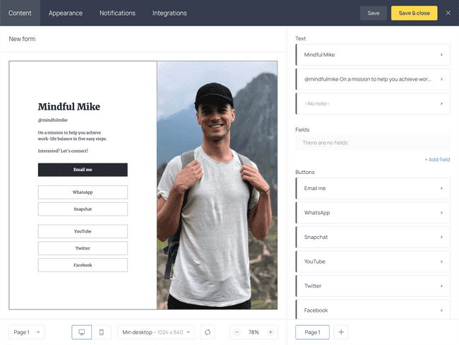
This is what it will look like:
Remember that you can customize your landing page by adding (or removing) buttons, descriptions, and various input fields to collect email addresses, orders, or feedback.
To do it, go through the right-hand menu and click on the element you’d like to edit.
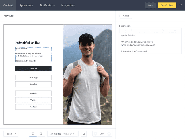
For instance, if you click on the text description, you’ll open up the following menu.
As you can see, you can easily edit the copy and place your own call to action here.
Now, let’s go edit the heart of your landing page – the buttons!
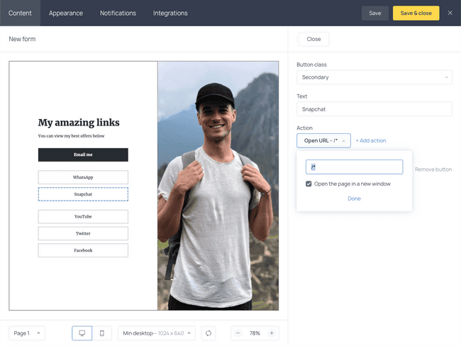
Your buttons will contain the links you want to display for your Instagram profile. Keep in mind that for now, we’re not editing the button’s appearance, but merely the text and what the button does.
To edit or remove a button, click on it in the right-side menu. You’ll get the following options:
The first dropdown menu allows you to switch the button class between primary and secondary. Primary buttons are typically used for a primary call to action. In this case, it’s the Email me button. You’ll be able to change the primary button’s color, too. Secondary buttons’ design always remains as is.
Now, the next field is self-explanatory – it helps you customize the text on the button.
Finally, to change the URL, select Open URL and type the page address you want to lead your audience to.
And that’s it!
Now you can add as many buttons as you want. Make sure the text clearly describes what you’re linking to and uses action-driven language.
For this example, I decided to have three buttons. But there’s nothing stopping you from adding many more buttons if you’d like.
Once you’re happy with your form’s content, it’s time to edit its appearance!
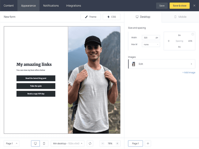
On the upper menu, select Appearance. On this tab, you can change the size and spacing, customize the image if you have one, add more images, and change the theme colors!
If you know CSS, you can also customize your page’s code. But for most use cases, that won’t be necessary.
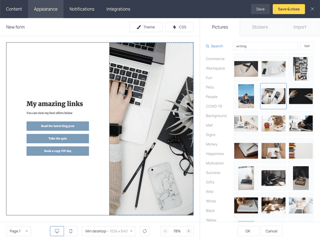
I decided to change my Theme settings to make the buttons turquoise since this fits in better with my brand. I also changed the background image.
One of the best parts of this tool is the ability to browse through tons of free images and directly add them in with a single click! Usually, I’d have to browse Unsplash, Canva, or other stock websites to get a nice photo. But I found one that I like right inside the Getform dashboard. You can also upload your own photo from the desktop.
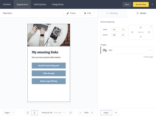
Once you’re done with the design elements, switch to the Mobile tab to see what your Instagram landing page will look like on mobile devices. Note that you can select a different picture for the mobile version or you can remove it entirely.
If you’re happy with your Instagram landing page, you can hit Save and close. That’s right – you don’t have to touch the other menus for now. Because we will just be redirecting users to a URL, there is no need to set up notifications or integrations.
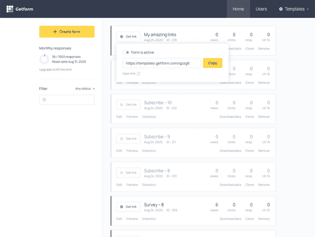
All you need to do to generate your link is select Get link on the form you just created.
Your URL will automatically appear, and you can copy it and test it out in your browser right away.
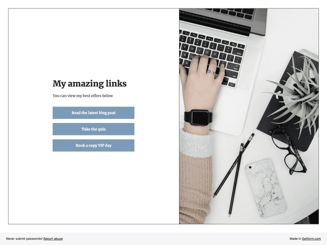
This is what my form looks like live!
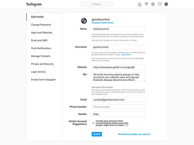
Now all you need to do is edit your website link in your Instagram account with the URL you were given:
That’s it! All in all, this took me about five minutes to do. Now, when your profile visitors click your link, they’ll be taken to your beautiful Instagram landing page and have the ability to access the links you gave them.
Increase traffic and conversions with Instagram landing pages
When you start using landing pages to your advantage, you can truly turn your Instagram profile into a powerful traffic-generating machine – no matter what your current goals are!
You can create your first landing page, even without a website, using Getform. Start your free trial today! Need more ideas for inspiration? Check this B2C landing page roundup. Then go ahead and create your first Instagram landing page using Getform. It’s free!
Try Getform today
Create a stylish Instagram landing page.
No coding, no designing skills needed.

Tips for your marketing strategy
Join creators worldwide
Grow your online business without a website. Generate leads, tag your subscribers, send promo emails, and build automations.
Get started, it's freethis week
this week
this week
this week
